Field guide · Diagnostic AI
How to read a “99% accurate” diagnostic-AI claim
A test can be 99% sensitive, 99% specific, have a 99% negative predictive value, or correctly classify 99% of a selected group. Those are four different numbers about four different sets of people, and none of them alone tells you whether the test improves anyone’s care. Here is how to take any such claim apart — ten questions, four figures you can work, and a prompt that puts the method to work on whatever claim is in front of you.
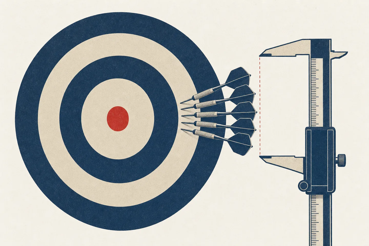
“Accuracy” is the most reassuring word in diagnostics and the least informative. It sounds like a property of the test, the way weight is a property of an object. It is not. It is a property of a particular measurement, made on a particular group of people, at a particular setting, judged against a particular idea of the truth. Change any of those and the number changes, sometimes enormously, without anything about the test changing at all.
This guide is written for anyone who has to decide what a diagnostic-AI number means: a journalist with a press release, a commissioner with a business case, a clinician with a vendor in the room, a patient with a headline. It assumes no statistics. It works for blood tests, radiology models, digital pathology, AI stethoscopes, symptom checkers, triage tools and wearables — anything that looks at a person and outputs a verdict.
The running example is real and recent, and we audited it in full: an NHS blood test reported in July 2026 as 99% accurate at both detecting and ruling out gynaecological cancer. Every question below caught something in that story. But the questions come first; the case is only the demonstration.
Data table
| Stage | What happens | Note |
|---|---|---|
| The metric behind the word “accurate” | at least eight candidates: sensitivity, specificity, positive and negative predictive value, overall classification accuracy, balanced accuracy, AUC, agreement with clinicians, and positive/negative percent agreement | |
| The counts underneath the percentage | “99% sensitivity” can mean one case missed out of a hundred, ten out of a thousand, or one out of a hundred and fourteen | |
| The population, and how common the disease was in it | sensitivity and specificity are held fixed in the predictive-value equations; prevalence enters through the mix of diseased and non-diseased people | |
| The threshold, and who drew it | almost every diagnostic AI outputs a continuous score — “positive” and “negative” only exist once somebody draws a line | |
| The truth the result was scored against | a biopsy, a pathology report, a specialist's opinion, a code in a medical record, an expert panel, or what happened over the following year | |
| The comparator, and the stage of evidence | whether it beats what the clinic does today — the existing blood test, scan, guideline or an experienced clinician's judgement — and whether the result was measured or modelled |
- This is a reading tool, not a scoring rubric: a study can be well designed at every stage and still be described badly in a press release.
- Industry-funded evidence is not worthless, and disclosed conflicts are a sign of a functioning system. The question is not whether a study was conflicted so much as whether anyone unconflicted has repeated it.
Ninety-nine percent of what?
Start by deleting the word “accuracy” and replacing it with the metric’s actual name. There are at least eight candidates — sensitivity, specificity, positive and negative predictive value, overall classification accuracy, balanced accuracy, AUC, agreement with clinicians, and positive/negative percent agreement — and a release that says “accurate” often does not say which one it means.
The four that matter most come from a single table. Imagine everyone who took the test, sorted by whether they really had the disease and what the test said:
- Sensitivity — of the people who had it, how many did the test catch?
- Specificity — of the people who didn’t, how many did it correctly leave alone?
- Positive predictive value — of the people it flagged, how many really had it?
- Negative predictive value — of the people it cleared, how many really were clear?
The first two read down the columns — they are facts about the disease groups. The last two read across the rows — they are facts about the test-result groups. They answer different questions, and a test can score brilliantly on one while failing on another.
There is also a quantity that is literally called accuracy — the share of everyone the test classified correctly. It is rarely reported, because for most real tools it is either flattering to the point of meaninglessness or brutal.
The same four boxes. Four different questions.
| Really has it | Really doesn’t | |
|---|---|---|
| Test says yes | 36true positive |
96false positive |
| Test says no | 4false negative |
864true negative |
Of the 40 people who really have it, 36 test positive. Sensitivity = 36/40 = 90%. It is a fact about people with the disease, and it says nothing about the 96 healthy people who were also flagged.
Ask: what is the metric’s exact technical name — and if the source won’t say, why not?
Out of how many?
“99% sensitivity” can mean one case missed out of a hundred, ten out of a thousand, or one out of a hundred and fourteen. It can also rest on seven cancers total, in which case the percentage is theatre.
Percentages hide two things at once: the clinical scale of the error, and the statistical uncertainty around it. A result built on a handful of positive cases has a confidence interval wide enough to reach well below the number in the headline. Always convert back to counts.
Identical headline. Four very different amounts of evidence.
Ask: how many actual cases produced this percentage, and what is the confidence interval?
Among whom — and how common was the disease?
This is the question that catches the most people, because the effect is so large and so counter-intuitive.
In the predictive-value equations, sensitivity and specificity are held fixed and prevalence enters through the mix of diseased and non-diseased people. Hold them fixed and take a test to a population where almost nobody is sick: its negative predictive value climbs towards 100% almost regardless of how well it discriminates, because “you’re fine” is nearly always the right answer. Take it to a specialist clinic and the predictive values change without a line of code changing. In the real world all three can shift at once, because moving a test to a new population usually changes the spectrum of disease, who gets verified, and how the threshold is applied.
So the reference point for any negative predictive value is not zero. A useful no-information comparator is clearing people at random, whose expected negative predictive value is simply the share of people who don’t have the disease. Drag the sliders and watch the gap between the bar and the marker. That gap shows how much the test enriched its cleared group with people who really were clear — not its total clinical value, which also depends on how many it cleared, what the misses cost, and what anyone does with the result.
A 99% negative predictive value can be mostly a fact about the population.
Jump to: · ·
Test 1,000 people at this disease rate and 39 of them have it. The test clears 193 people — and misses fewer than one of them. It flags 807 — of whom 769 do not have it.
Ask: how common was the disease in the study, how common will it be where the tool is actually used, and what would random guessing have scored?
At which threshold — and who chose it?
Almost every diagnostic AI outputs a continuous score. “Positive” and “negative” only exist once somebody draws a line. Move the line and sensitivity, specificity, workload, cost and the number of missed cases all move together, in opposite directions. There is no setting that is best at everything.
This creates two distinct problems. The first is honest but easy to miss: a result quoted at a rule-out threshold and a result quoted at a rule-in threshold are not comparable, even from the same model on the same day. The second is not honest: a threshold chosen after seeing the data, because it produced the nicest number, is a form of overfitting.
And watch for the reverse trick — where the setting is reported as though it were a discovery. If a threshold is defined as “clear the lowest-scoring 20%,” then “this test can clear one in five patients” is not a finding. It is the instruction, read back.
Move the threshold. Every number in the headline moves with it.
Scores the model gives
The whole curve = AUC 0.86
Ask: was the threshold fixed in advance — and is any headline proportion actually just the threshold restated?
What happens to the people it gets wrong?
Every threshold is a decision about which error to prefer, and that decision should be made by thinking about people, not about the shape of a curve.
For a cancer rule-out, it depends entirely on what is done with the result. If a low-risk score is used to stop or defer investigation, a false negative may mean false reassurance and delay. A false positive usually just leaves the patient on the pathway they were already on, though it can trigger extra work. Those are not equivalent harms — but note that low specificity mostly limits how much capacity a rule-out policy can release, rather than proving it creates new work.
Note also what the displaced test was doing. Replacing a scan with a blood test is only equivalent if the scan was only ever answering the one question. Scans tend to see more than the thing they were ordered for.
Ask: what happens to a real patient when this model is wrong in each direction — and what else was the old test catching?
How was “truth” decided?
Every accuracy figure is a comparison against something the researchers treated as the truth: a biopsy, a pathology report, a specialist’s opinion, a code in a medical record, an expert panel, or just what happened over the following year. A model cannot be more reliable than the labels it was graded against.
Record-derived labels are the common weak point. If “had cancer” means “has a cancer code recorded within three months,” then anyone diagnosed in month four is counted as a true negative — and the test gets credit for clearing them.
Ask: how did the researchers decide who truly had the disease, and over what window?
Who was left out?
Follow the flow chart. Almost every study loses people between the front door and the final table — incomplete data, unreadable images, unresolved diagnoses, patients whose records could not be linked. Sometimes that is unavoidable. It is still a place where performance can quietly improve.
The specific thing to check: are the enrolment number and the analysis number the same? If a claim quotes the larger one next to statistics computed on the smaller one, the arithmetic on offer is not the arithmetic that was done.
Ask: who entered, who was excluded, who disappeared before the final analysis — and which of those numbers is the denominator of the headline?
Compared with what?
The interesting question is almost never whether the AI beats chance. It is whether it beats what the clinic does today — the existing blood test, the existing scan, the existing guideline, or an experienced clinician’s judgement. A model can be impressive and still be worse than the cheap thing already in use.
Be careful with AUC here. It measures how well a model ranks sick above healthy across every possible threshold, which makes it good for comparing models and poor for telling you what happens to patients. A better AUC does not guarantee better behaviour at the one setting clinicians will actually use.
And establish where any head-to-head comparison came from. Comparisons are the most quotable thing in a press release and the easiest to introduce from outside the study.
Ask: is this replacing an existing test, adding to it, or deciding who gets it — and is the comparison in the paper?
Was it measured, or modelled?
This is the question that separates most health-AI claims from most health-AI evidence, and it comes in two parts.
First, what kind of evidence was it? These are five different stages, and press coverage calls them all “trials”. They overlap — a study can be external and prospective at once — but each answers a different question:
- Internal validation — tested on data from the same source it was built on.
- External validation — tested somewhere else, on someone else’s patients.
- Prospective silent validation — run live on new patients, but nobody is shown the output.
- Live implementation — clinicians see the output and act on it.
- Impact evaluation — outcomes compared against a credible counterfactual.
A prospective silent validation is a strong design and much better than a retrospective one. But it cannot, even in principle, show that anything improved — because nothing was allowed to change.
Second, benefit claims. “Could save 18,000 procedures,” “could prevent 5,000 deaths,” “could save £100 million” are almost always chains: study performance × national population × assumed uptake × assumed clinician compliance × assumed costs. Ask which links were measured. Usually it is the first one.
Ask: did the tool change a single real decision — and for any headline benefit, which steps were observed and which were assumed?
Who checked it?
Industry-funded evidence is not worthless — companies fund the studies because nobody else will, and vendor scientists are often the people who understand the model best. Disclosed conflicts are a sign of a functioning system, not a scandal.
But funding changes what still needs to happen, and the question to ask is not “was this conflicted?” so much as “has anyone unconflicted ever repeated it?” Look at the whole evidence base rather than the single paper: if every study of a tool shares authors, funders or data with its manufacturer, then no matter how many papers there are, the result has been produced once.
Regulatory language deserves the same scrutiny. “CE marked,” “UKCA marked” and “fully regulated” can mean an approved body assessed the device’s performance — or that the manufacturer filled in a form. For the lowest device classes, it is the form.
Ask: could an outside team reproduce this — and has one?
Evaluate a claim yourself
Take the ten questions to your own AI
Paste a study, press release, model card or news story below. This turns the ten questions into a prompt that makes any assistant show its working — name the metric, find the denominators, check the threshold and the reference standard, and say plainly what is missing. Copy it into ChatGPT, Claude, or Gemini. It does not do the judging for you; it makes the gaps visible so you can.
You are evaluating an accuracy claim about {{SUBJECT}}, using the "Ground Truth" method (groundtruth.health). The material to evaluate is at the end of this message. {{MODE}}

1. Ninety-nine percent of what? Replace the word "accurate" with the metric's exact technical name — sensitivity, specificity, positive or negative predictive value, overall classification accuracy, AUC, agreement, or positive/negative percent agreement (PPA/NPA, which resembles sensitivity and specificity but concedes there is no reference standard). If the source never names it, say so: that is the finding.
2. Out of how many? Give the numerator and denominator behind the headline percentage, quoting the source. If the source reports a confidence interval, quote it. If it does not, write "no interval reported" — and only then, if and only if you have the exact numerator and denominator, compute one, show the arithmetic and name the method. Never state an interval you cannot derive from numbers printed in the source. A percentage resting on a handful of cases is compatible with performance nobody would accept.
3. Among whom, and how common was the disease? Predictive values move with prevalence. Quote the disease rate in the study population. Then say whether the source states where the tool is intended to be used and at what disease rate there — if it does not, write "not stated" and do not supply a figure from your own knowledge. If you have relevant background knowledge, put it on a separate line marked "outside the source, unverified", give a range rather than a point, and do not use it in any calculation. Finally, give the negative predictive value that clearing people at random would have scored in the study population (1 − prevalence), and set the reported NPV against it.
4. At which threshold, and who chose it? Was the operating point fixed before the analysis or picked after? Check whether any headline proportion — "rules out one in five" — is simply the threshold restated.
5. What happens to the people it gets wrong? Take each direction separately, and judge it against what would actually be done with the result. Note anything the replaced test was also catching incidentally.
6. How was "truth" decided? Biopsy, pathology, imaging, a coding record, or just no diagnosis recorded within a window? A model cannot be more reliable than the labels it was graded against.
7. Who was left out? Compare the number enrolled with the number analysed, and check which of the two is the denominator of the headline. Separately, ask how many samples or images returned no usable result at all — invalid, insufficient, indeterminate, QC failure — and whether those people appear in that denominator.
8. Compared with what? Current care, an existing marker, clinician judgement — or nothing? Beware AUC standing in for performance at the threshold clinicians will actually use, and check whether any head-to-head comparison is in the paper at all.
9. Was it measured or modelled? Distinguish internal validation, external validation, prospective silent validation, live implementation and impact evaluation. For any projected benefit — procedures saved, lives saved, money saved — separate the steps that were measured from the steps that were assumed. Then answer plainly: did the study show the tool changing a single real clinical decision, yes or no?
10. Who ran it, who funded it, and has anyone unconflicted repeated it? Treat disclosed conflicts as a signal about what verification is still needed, not as proof of bad faith. Check what "regulated" or "CE/UKCA marked" actually means for this device class.

Quote the exact sentence the source uses for each answer. Where the source is silent, write "not stated" rather than inferring, and never supply a number the source does not give — no invented confidence intervals, denominators or prevalences.

Work only from the material below. If I have given you a link rather than the text and you cannot open it, say so and stop — do not reconstruct the source from memory, and do not produce quotes you have not read. If you recognise the study, keep anything you know from outside the pasted text in a separate section headed "outside the source, unverified", and never render it as a quotation. Before answering question 1, say what you are actually holding: the study itself, an abstract, a press release, or a news story about a study. If it is a restatement rather than the study, say so plainly — your answers then describe the restatement, and the gaps you find may be the reporter's rather than the researchers'.

Finish with: (a) an honest one-line restatement of what the evidence actually supports, (b) the single most important thing that is missing, and (c) what would have to be shown to believe the claim as written.

CLAIM / STUDY TO EVALUATE:
{{CLAIM}}
The method is ours; the judgement stays yours. An assistant can find the denominators and name the metric — it cannot tell you how safe is safe enough for the people in the remaining one percent.
The translation rule
When someone tells you a diagnostic AI is 99% accurate, the useless response is to ask whether 99% is high. Of course it is high. Every number chosen for a headline is high.
The useful response is six questions long, and you now have all six. What exactly was counted? Among whom, and how many of them were ill? At which setting, and who picked it? Against what standard of truth, and compared with what we already do? Did it change a single real decision, or was the benefit modelled? And what happens to the people in the remaining one percent?
A percentage is the end of somebody’s analysis. It should be the beginning of yours.
See these questions applied to a live claim: our investigation of the NHS cancer blood test reported as “99% accurate” — where one diagnosed cancer scored below the rule-out line, and overall classification accuracy is 23%.
Disclosures & provenance
- Published
- 25 Jul 2026 · last updated 27 Jul 2026
- Author
- The Ground Truth editor. Editorial standard →
- Funding
- Self-funded. Ground Truth takes no money from, and has no affiliation with, any organization examined here. Independence policy →
- Corrections
- Corrected 27 Jul 2026 — The 578-woman ultrasound comparison also appears in the company's own press release, which attributes it to an unpublished sub-analysis held as “data on file.” Our finding that it cannot be traced to any published study is unchanged. Corrections log →